The silent architecture beneath your words, line spacing – or leading, as it’s known in typography – profoundly impacts reader experience. It’s not merely a technical setting; it’s a strategic design choice that dictates readability, visual flow, and even the perceived professionalism of your book. For writers, understanding and consciously controlling this element is paramount. Neglecting it leads to cramped, fatiguing pages or sparse, unprofessional layouts. Mastering it transforms your manuscript from a block of text into an inviting, effortlessly digestible narrative.
This comprehensive guide delves into the nuances of line spacing, providing actionable insights and concrete examples to empower writers to make informed decisions that elevate their books. We’ll explore the ‘why’ behind ideal spacing, the ‘how’ of implementing it across various platforms, and the subtle ‘what if’ scenarios that separate a good reading experience from a truly exceptional one.
The Unseen Power: Why Line Spacing Matters More Than You Think
Before we delve into the mechanics, let’s establish the fundamental importance of line spacing. It’s the invisible hand guiding the reader’s eye, either smoothly from one line to the next or causing them to stumble.
Readability and Comprehension: This is the primary driver. Text with insufficient line spacing merges into a dense block, making it difficult for the eye to distinguish individual lines. This forces the reader to work harder, leading to eye strain and reduced comprehension. Conversely, excessive line spacing creates a disconnected, fragmented reading experience, breaking the natural flow of thought. The sweet spot allows the eye to effortlessly glide across the page without losing its place.
- Example of Poor Readability (Too Tight):
Theoldhouseonhillwassilent,itswindowsstaringoutlikeeyesintoendlessnight.Dustcoatedevery
surface,ahistoryofabandonmentetchedintoitsverybeams.Footstepsechoedinmyeardrums. - Example of Improved Readability (Optimal):
The old house on the hill was silent, its windows staring out like eyes into the endless night.
Dust coated every surface, a history of abandonment etched into its very beams.
Footsteps echoed in my eardrums.
Visual Appeal and Professionalism: A well-spaced page looks inviting and professional. It demonstrates attention to detail and an understanding of print design principles. Cramped text screams amateur, while overly loose text looks sloppy and wastes valuable page real estate.

Pacing and Rhythmic Flow: Believe it or not, line spacing contributes to the rhythmic flow of your narrative. Shorter lines with slightly increased leading can create a lighter, faster pace, ideal for dialogue or action sequences. Longer lines with a more standard leading can encourage a slower, more contemplative read.
Page Count and Production Costs: In print books, line spacing directly influences page count. Tighter spacing means fewer pages, potentially reducing printing costs. However, this saving shouldn’t come at the expense of readability. Balancing cost with reader experience is key.
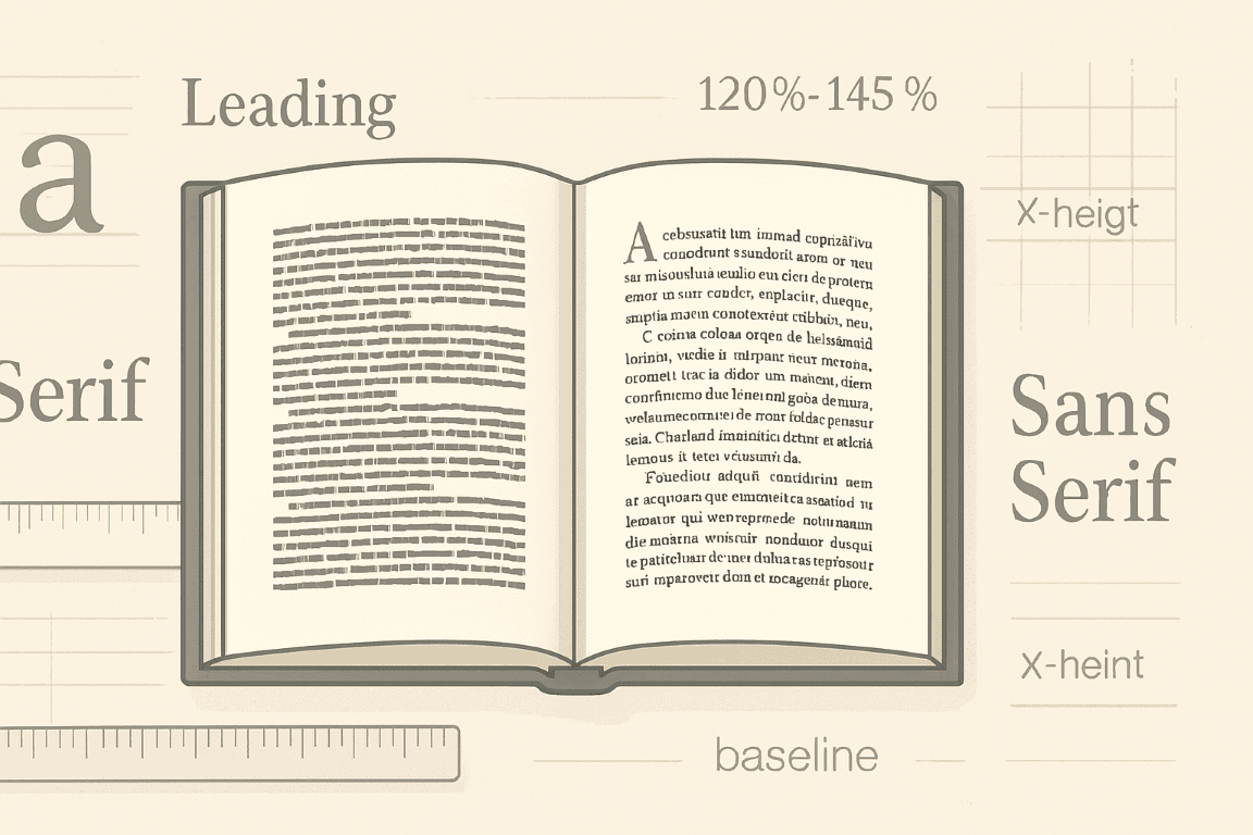
The Golden Ratio of Leading: Understanding the Basics
The universal guideline for line spacing dictates that leading should be approximately 120% to 145% of the font size. This isn’t a hard-and-fast rule but a powerful starting point.
- Font Size: The size of your actual characters. Common body text sizes for books range from 10pt to 12pt.
- Leading (Line Spacing): The vertical distance from one baseline of text to the next. It’s often expressed in points, just like font size.
Let’s illustrate:

- If your font size is 10pt, a good starting leading would be between 12pt (10pt * 1.2) and 14.5pt (10pt * 1.45).
- If your font size is 12pt, ideal leading would be between 14.4pt (12pt * 1.2) and 17.4pt (12pt * 1.45).
Many word processors and desktop publishing software default to “single spacing,” which often means the leading is set to the font size + a small increment, or “auto” leading, which roughly adheres to the 120-145% rule. However, relying on defaults without understanding the underlying principle is a recipe for suboptimal results.
Beyond the Default: Factors Influencing Optimal Line Spacing
While the 120-145% rule provides a strong foundation, several other factors demand consideration for truly optimal line spacing.
1. Font Choice Matters (and Why Sans-Serif Differs from Serif):
Different fonts have varying x-heights (the height of lowercase letters like ‘x’ or ‘a’) and ascenders/descenders (parts of letters that extend above/below the main body, like ‘h’ or ‘p’).
- Serif Fonts (e.g., Garamond, Times New Roman, Baskerville): These fonts have small decorative strokes (serifs) at the end of character strokes. They tend to have a more traditional, classic feel and are generally considered highly readable for long-form text. Due to their visual characteristics, they often benefit from slightly more generous leading within the 120-145% range, perhaps closer to 135-145%, to prevent the serifs from visually merging between lines.
- Example (Garamond 11pt, 16pt leading):
> The old clock in the hall chimed thirteen, a somber declaration that went unheard.
> Dust motes danced in the lone shaft of moonlight, illuminating nothing.
- Example (Garamond 11pt, 16pt leading):
- Sans-Serif Fonts (e.g., Helvetica, Arial, Calibri, Open Sans): These fonts lack serifs. They often have a cleaner, modern aesthetic and are popular for digital displays and titles. Due to their plainer forms, they can sometimes tolerate slightly tighter leading within the 120-130% range, though careful testing is always required. Too tight, and they can look blocky.
- Example (Open Sans 11pt, 15pt leading):
> The old clock in the hall chimed thirteen, a somber declaration that went unheard.
> Dust motes danced in the lone shaft of moonlight, illuminating nothing.
- Example (Open Sans 11pt, 15pt leading):
2. Line Length and Column Width:
This is one of the most critical, yet often overlooked, factors. The longer your lines of text, the more leading you need.
- Short Lines (e.g., poetry, narrow columns): When lines are short, the eye doesn’t have to travel as far horizontally before returning to the next line. You can often get away with slightly tighter leading without sacrificing readability.
- Long Lines (e.g., standard book pages): For typical book widths, lines are relatively long. The eye needs a clear path to jump from the end of one line to the beginning of the next. Insufficient leading on long lines makes it easy for the reader to accidentally re-read the same line or skip a line entirely. Aim for the higher end of the 120-145% range.
- Concrete Example: Imagine a book printed with an overly wide text block, perhaps 6.5 inches across. If you use 11pt font with only 13pt leading, the vast horizontal distance covered by each line, combined with minimal vertical separation, will make it incredibly difficult for the eye to track properly. The reader will constantly lose their place. Increasing the leading to 15pt or even 16pt for such a wide column would dramatically improve tracking.
3. Target Audience / Reader Demographics:
Consider who your book is for.
- Children’s Books / Early Readers: Often require much larger font sizes and significantly more generous leading (sometimes 200% or more) to aid developing readers and accommodate illustrations.
- Elderly Readers / Visually Impaired: Benefit from larger font sizes and increased leading to compensate for declining eyesight. A 12pt font with 18pt leading might be ideal.
- Academic Texts / Highly Specialized Content: While still prioritizing readability, these might tolerate slightly denser layouts than a general fiction novel, but never to the point of being unreadable.
4. Paper Type and Ink Bleed:
In print, the physical medium matters.
- Thin, Absorbent Paper: Can cause minor ink bleed (feathering), which effectively makes the text appear bolder and can slightly reduce the perceived white space. You might need to add a touch more leading to compensate.
- Thick, Coated Paper: Provides crisp text lines. You might be able to use standard leading without issues.
5. Body Text vs. Other Elements (Headings, Captions, Footnotes):
Line spacing for different textual elements should vary.
- Headings: Often have tighter leading relative to their font size, or even negative leading (meaning the lines overlap slightly), especially for multi-line headings. This creates a compact, unified visual block.
- Captions/Footnotes: Typically use smaller font sizes than the main body text. They might also have slightly tighter leading relative to their size, but still within the “readable” range. The goal is to set them apart visually without making them unreadable.
- Example: If your body text is 11pt/16pt, a caption might be 9pt font with 11pt leading.
Practical Application: Controlling Line Spacing in Your Tools
Now, let’s get hands-on with the software tools writers commonly use.
1. Microsoft Word:
Word uses “Line Spacing” options rather than explicit “leading.”
- Access: Select the text you want to adjust. Go to the “Home” tab, then find the “Paragraph” group. Click the small arrow in the bottom right corner (or right-click the text and select “Paragraph”).
- Options:
- Single, 1.5 Lines, Double: These are relative to your font size. “Single” is usually font size + approx. 20%. “1.5 Lines” multiplies the single spacing by 1.5. “Double” multiplies by 2. These are convenient but less precise for fine-tuning.
- “At Least”: This is your best friend for precise control. Select “At Least” and then type in your desired leading in points (e.g., type “16 pt” if your font is 11pt and you want 16pt leading). This ensures lines will be at least that far apart, allowing for varying heights of characters (like those with accents).
- “Exactly”: Use with caution. This sets the leading to an exact value, even if it causes ascenders/descenders to clip. Generally, “At Least” is safer.
- “Multiple”: Allows you to enter a multiplier (e.g., 1.4 for 140%). This is useful for maintaining a proportional relationship with font size, especially if you plan to change font sizes later.
- Concrete Word Example:
- Select your entire manuscript text (Ctrl+A).
- Go to the “Paragraph” settings.
- Under the “Spacing” section, change “Line Spacing” to “Multiple.”
- In the “At:” box, enter “1.4” (for 140% of font size).
- Click “OK.”
This quickly applies a proportional leading throughout. Now, spot-check different pages to ensure it looks good across various content types (dialogue, dense paragraphs). You might then selectively increase or decrease for specific sections.
2. Google Docs:
Similar to Word, but with fewer advanced options.
- Access: Select text. Go to “Format” > “Line & paragraph spacing.”
- Options:
- Single, 1.15, 1.5, Double: Pre-set multipliers.
- Custom Spacing: Allows you to input a numerical value that acts as a multiplier. If your font is 10pt and you enter “1.4,” it will result in 14pt leading.
- Concrete Google Docs Example:
- Select all text.
- Go to “Format” > “Line & paragraph spacing” > “Custom spacing.”
- Enter “1.4” in “Line Spacing.”
- Click “Apply.”
This is the closest you get to precise leading control in Docs.
3. Scrivener (for Export Control):
Scrivener is a writing tool, but its compile function offers powerful control over line spacing in your final output (ePub, MOBI, PDF, Word).
- Access: “File” > “Compile” (or Ctrl+Shift+C).
- Settings: The exact location depends on your compile format and chosen compile “Preset,” but typically look under:
- “Formatting” Pane: Here you often define the font and line spacing for different text types (e.g., “Body Text,” “Heading 1”). You’ll see dropdowns like “Line Height” or “Line Spacing.” This can be set as a percentage or specific pt value.
- “EPUB/MOBI/PDF Options” / “Stylesheet” Panes: For eBooks, you can define CSS styles within Scrivener’s compile settings that dictate line height. For PDF, you might specify fixed point values.
- Concrete Scrivener Example (for PDF/Print output):
- Go to “File” > “Compile.”
- Choose a compile format (e.g., “Print” or “PDF”).
- Select a “Compile For” preset (e.g., “Paperback”).
- In the left sidebar, click “Formatting.”
- Select “1. Body Text” from the list of section types.
- In the settings pane on the right, ensure “Font” is set (e.g., Garamond 11pt).
- Locate “Line Height” or “Line Spacing.” Change “Single” to “Custom” or “Multiple” and enter a value like “15pt” (if your font is 11pt, this gives you generous leading for easy reading).
- Repeat for any other text elements you want to control.
Scrivener’s power lies in applying these settings consistently during compilation, overriding what you see in your editor.
4. Desktop Publishing Software (e.g., Adobe InDesign, Affinity Publisher):
These are the gold standard for print layout and offer the most granular control.
- Access: Select the text frame or specific text. In the “Properties” panel or “Character” panel, you’ll find the “Leading” control, usually next to the font size. It’s represented by two lines of text with an arrow between them.
- Control: You directly input the point value for leading (e.g., “16 pt”). By default, it might be set to “Auto,” which is typically 120% of font size.
- Concrete InDesign Example:
- Create a text frame and fill it with your manuscript text.
- Select the entire text within the frame (Ctrl+A).
- In the “Properties” panel (or “Character” panel), set your font (e.g., “Baskerville Regular,” “10 pt”).
- Immediately to the right of the font size, find the “Leading” field. It will likely show “Auto” or a default value. Change this to “14.5 pt.”
- Observe the immediate change in line spacing. Try increasing it to “16 pt” and decreasing it to “12 pt” to see the dramatic difference. This direct numerical input gives you absolute control.
The Art of Refinement: Micro-Adjustments and Testing
The journey to perfect line spacing doesn’t end with setting a default. It involves meticulous refinement.
1. Print Proofing is Non-Negotiable:
Looking at your book on a screen is one thing; holding a physical copy is another. Print a test chapter or two.
- Readability Test: Read it aloud. Does your eye flow smoothly? Do you lose your place? Does it feel cramped or too airy?
- Visual Balance: Hold a page at arm’s length. Does the text block look balanced and inviting? Is there enough “white space” around the text, or does it feel overwhelming?
- Fatigue Check: Read for 15-20 minutes. Do your eyes feel strained? This is a strong indicator that spacing might be too tight.
2. Test on Different Devices (for eBooks):
Line spacing for eBooks is often controlled by the reader’s device settings, but your base file still influences the default.
- ePub/MOBI: Test on Kindle e-readers, Kindle apps, Apple Books, Kobo, etc. While users can change font size, they can also often adjust line spacing. Your default should be comfortable.
- Responsive Design: Understand that line length will dynamically change based on screen size. Your goal is to provide a solid baseline that adapts well.
3. Contextual Adjustments:
While maintaining overall consistency, don’t be afraid to make minor, deliberate adjustments for specific elements.
- Dialogue Blocks: Sometimes slightly tighter or looser spacing in dialogue can subtly enhance its feel, though this is an advanced technique and requires a keen eye.
- Blockquotes: Often set with a slightly smaller font size and the same or marginally larger leading relative to their font size compared to the main body, ensuring they stand out without being unreadable.
- Scene Breaks: White space around text (paragraph spacing) is just as important as line spacing within text. Ensure consistent paragraph indents and extra space at scene breaks for clear visual segmentation.
4. Paragraph Spacing vs. Line Spacing:
These are distinct. Line spacing controls the gap between lines within a paragraph. Paragraph spacing controls the gap between different paragraphs.
- Consistency: Choose a consistent method for separating paragraphs: either a first-line indent OR extra space between paragraphs, but rarely both. For most fiction, a first-line indent is standard for print. For digital text, extra space can sometimes be preferred as indents can be finicky on responsive screens.
- Avoid Excessive Space: Too much space between paragraphs breaks the flow of thought unnecessarily.
Common Mistakes and How to Avoid Them
- Relying Solely on “Single” or “Double” Spacing: These are crude tools. Investigate “At Least,” “Exactly,” or “Multiple” options for precise control.
- Forgetting About Line Length: Using the same leading for a narrow poetry column as for a wide prose page is a recipe for disaster.
- Neglecting Font Choice: Different fonts behave differently. Don’t assume a leading that works for Garamond will work equally well for Arial.
- Ignoring Proofing: What looks great on your monitor might be unreadable in print. Always, always print and read.
- Overthinking/Underthinking: Find the balance. Don’t obsess over fractions of a point, but don’t just leave it on default either. Make an informed decision, then test.
Final Thoughts: Your Book, Your Reader’s Experience
Controlling line spacing isn’t about rigid adherence to rules; it’s about understanding the principles and applying them with intention. It’s about respecting your reader’s time and attention. By meticulously crafting the visual landscape of your words, you remove potential friction points, allowing your narrative to truly shine. The time invested in perfecting your line spacing is an investment in your book’s readability, its professionalism, and ultimately, its success. It transforms your manuscript from mere words on a page into an immersive and enjoyable journey for those who delve into its depths.