The dream of holding your published book, your words etched into physical form, is within reach. For many independent authors, IngramSpark is the gateway to that dream, offering robust global distribution. However, navigating its intricate formatting requirements can feel like deciphering an ancient, unyielding language. The truth is, it’s not; it’s a system, and like any system, it has rules. This comprehensive guide will strip away the mystery, providing you with a definitive, actionable roadmap to easily format your book for IngramSpark, ensuring it meets their specifications and looks professional worldwide. No more frantic last-minute revisions, no more rejections, just a streamlined path from manuscript to marketplace.
The Foundation: Knowing Your Book (Before You Even Open Word)
Before you touch a single setting in your word processor, you need to make crucial decisions that dictate your entire formatting process. Rushing this step is the most common pitfall.
Paperback vs. Hardcover: Different Beasts, Different Needs
IngramSpark handles both paperback and hardcover editions, each with distinct specifications. Though the core interior formatting principles overlap, cover design and spine measurements diverge significantly. Decide which formats you’ll offer first. Many authors start with paperback, due to lower print costs and wider market acceptance, then add hardcover later. Note that a print-on-demand hardcover will have different binding (case laminate, glued) than a traditional jacketed hardcover. IngramSpark primarily offers case laminate hardcovers for POD.
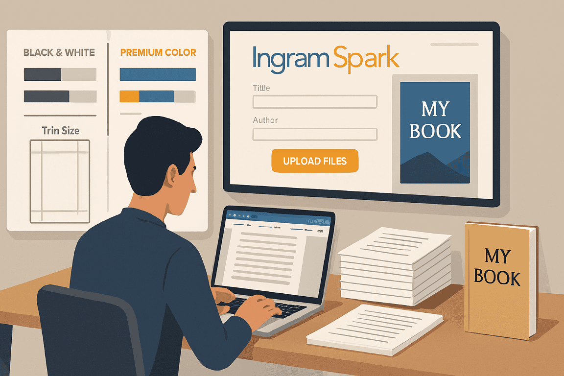
Interior Color: Black & White or Full Color?
This is perhaps the most significant financial and technical decision.
* Standard Black & White: Ideal for novels, memoirs, and non-fiction with minimal or no images. Print costs are significantly lower. IngramSpark offers various paper options (cream, white) for this.
* Standard Color: Suitable for books with limited color elements like charts, graphs, or a few illustrations. More expensive than B&W.
* Premium Color: Essential for art books, photography books, children’s books, or any publication where color accuracy and vibrancy are paramount. Uses higher quality paper and ink, resulting in the highest print cost.
Your choice here dictates required image resolution (discussed later) and overall file size considerations.

Trim Size: The Dimensions of Your Dream
Trim size is the physical dimension of your finished book. This is critical and immutable once set. Changing it means reformatting your entire interior and cover.
* Popular Novel Sizes: 5″ x 8″ (12.7 x 20.32 cm), 5.25″ x 8″ (13.33 x 20.32 cm), 5.5″ x 8.5″ (13.97 x 21.59 cm), 6″ x 9″ (15.24 x 22.86 cm). These are standard and widely accepted.
* Non-Fiction/Children’s Books: Often use larger sizes like 7″ x 10″ (17.78 x 25.4 cm) or 8.5″ x 11″ (21.59 x 27.94 cm) for easier readability of complex content or larger illustrations.
Actionable Tip: Research books in your genre and note their trim sizes. Walk into a bookstore and physically pick up books you like. Compare how they feel. This tactile experience is invaluable. For example, a sprawling epic fantasy might benefit from a 6″ x 9″ trim, offering a more substantial feel, while a quick-read novella might be perfect at 5″ x 8″.
Page Count: The Moving Target
Your page count directly impacts spine width for your cover and potential print costs. It’s fluid until your interior is fully formatted. However, an estimated page count at this stage helps in rough planning. A general rule of thumb is a 5″ x 8″ book with standard 12pt font and generous margins averages around 250 words per page. So, a 75,000-word novel might be approximately 300 pages.
Setting Up Your Document: The Global Settings in Microsoft Word (or Equivalent)
Microsoft Word is the most commonly used, and often most forgiving, software for interior formatting. While professional designers use InDesign, Word is perfectly adequate for 95% of self-published books.

Page Setup: The Foundation of Your Interior File
- Open a New Document: Start fresh. Do not try to reformat a manuscript you’ve written directly in. Copy and paste your plain text into a new document once the settings are applied.
- Page Size (Trim Size): Go to
Layout > Size > More Paper Sizes. Input your chosen trim size (e.g., 5.5 inches width, 8.5 inches height). This is paramount. - Margins: The White Space Breath
- Go to
Layout > Margins > Custom Margins. - IngramSpark requires specific minimum margins based on page count due to their binding process. Always err on the side of slightly larger margins.
- Recommended Baseline (for books under 150 pages): Top: 0.5″, Bottom: 0.5″, Inside: 0.625″ (0.75″ is safer for small books), Outside: 0.5″.
- For books 150-300 pages: Top: 0.5″, Bottom: 0.5″, Inside: 0.75″, Outside: 0.625″.
- For books over 300 pages: Top: 0.5″, Bottom: 0.5″, Inside: 0.875″ to 1″, Outside: 0.625″.
- Gutter: Leave this at “0.” The gutter is automatically incorporated into the “inside” margin when you select “Mirror margins” below.
- Multiple Pages: Select “Mirror margins.” This ensures your inside margin (the one near the spine) is wider than the outside margin, allowing text to be easily read without being swallowed by the binding.
- Apply to: “Whole document.”
- Go to
Concrete Example: For a 300-page 6″ x 9″ novel, your page setup would be: Width: 6″, Height: 9″. Margins: Top: 0.5″, Bottom: 0.5″, Inside: 0.875″, Outside: 0.625″. Mirror margins selected.
Bleed: For Images and Color that Touch the Edge
If your book has images or color blocks that extend to the very edge of the page (e.g., full-page illustrations in a children’s book), you need to incorporate bleed.
* What it is: A safety margin where your image/color extends beyond the trim line. When the book is trimmed, this excess is cut off, ensuring no white lines appear if the cutter is slightly off.
* How to apply it (for the printer): You don’t add “bleed” to your Word document’s dimensions directly. Instead, you design your images/elements to extend an extra 0.125 inches (or 1/8th of an inch) beyond your chosen trim size on any side where bleed is desired.
* Example: For a 6″ x 9″ book with full-page images that bleed, your image file on all four sides would need to be 6.25″ x 9.25″ (6 + 0.125 + 0.125 by 9 + 0.125 + 0.125). Word itself does not handle bleed for the overall document; you design elements within the document to extend beyond the page edge for export. The PDF export process often manages this by allowing you to add crop marks, which signify the trim line, with the extra content outside it being the bleed.
Crucial Point: If your book has any elements that bleed, you must select the “bleed” option during the IngramSpark upload process. Uploading a non-bleed file with bleeding elements will lead to rejection.
Sections: When Layouts Change
Use sections breaks (Layout > Breaks > Next Page) when:
* Changing page numbering: (e.g., front matter with Roman numerals, main body with Arabic).
* Changing layout: (e.g., a chapter opening requiring a different header/footer than the body text).
* Beginning a new chapter: Though often a simple page break is sufficient for chapters, section breaks offer more control.
Crafting the Interior Content: From Chapter to Font
Now that your document dimensions are set, it’s time to shape your words.
Front Matter: The Book’s Introduction
This crucial section sets the stage before your story or content truly begins.
* Half Title Page (Optional): Just your book title.
* Series Title Page (Optional): If part of a series.
* Title Page: Book title, subtitle (if any), author name, publisher imprint.
* Copyright Page: Absolutely essential. Include:
* Copyright notice (e.g., © [Year] [Your Name/Company]).
* All rights reserved.
* ISBN (distinct for each format: paperback, hardcover, ebook).
* Publisher information (your imprint).
* Legal disclaimers (e.g., fiction disclaimer, medical disclaimer for health books).
* Credits for cover design, interior formatting, editing (optional but professional).
* Dedication (Optional): Typically right after the copyright page.
* Table of Contents (ToC): For non-fiction, indispensable. For fiction, optional but can be useful for longer works. Learn to generate an automated ToC in Word using Headings (see next section).
* Foreword/Preface/Acknowledgments (Optional):
* Epigraph (Optional): A quote at the beginning of the book or individual chapters.
Formatting Tip for Front Matter: Often, front matter pages are unnumbered, or numbered with Roman numerals. Use Word’s section breaks before your main content to reset page numbering to Arabic numerals starting from 1 for your first chapter.
Body Matter: The Heart of Your Book
Chapter Openings: Design and Consistency
New chapters always start on a new page, often a right-hand page (odd page number).
* Consistent Heading Style: Define a Heading 1 style for your chapter titles. Set its font, size, spacing, and whether it’s centered, left-aligned, or drops down the page. Do this once, then apply it to all chapters.
* Spacing Below Chapter Title: Ensure adequate white space between your chapter title and the start of the text. This improves readability.
Body Text: Readability is King
Your primary text should be easy on the eyes.
* Font Choice:
* Serif Fonts: Ideal for body text (e.g., Garamond, Times New Roman, Baskerville, Palatino Linotype, Georgia, Lora). They aid readability in longer passages. Aim for a classic, professional look.
* Sans-Serif Fonts: Best for titles, headings, and digital text (e.g., Arial, Calibri, Open Sans, Lato). Use sparingly in print body text.
* Embed All Fonts: Regardless of your choice, ensure all fonts are embedded when you create your PDF. IngramSpark will reject files with unembedded fonts.
* Font Size:
* Novels/Non-Fiction: 10pt to 12pt is standard. 11pt is a popular middle ground. Avoid anything smaller than 10pt for readability.
* Children’s Books: May use larger font sizes (e.g., 14pt-18pt) to fill the page and aid young readers.
* Line Spacing (Leading):
* 1.15 to 1.25 is typical for single-line spacing. Avoid single-spacing (1.0) as it makes text feel dense. In Word, go to Paragraph settings > Line spacing and choose “Single” then “At least” with a value slightly higher than your font size (e.g., for 11pt font, use 13pt or 14pt leading). Or simply use 1.15 or 1.25 line spacing option.
* Alignment:
* Justified Text: The default for print books, aligning text to both the left and right margins, creating clean blocks of text. Ensure hyphenation is turned on in Word (Layout > Hyphenation > Automatic) to prevent large gaps between words.
* Left-Aligned (Ragged Right): Common for poetry, children’s books, or some non-fiction where a more informal look is desired.
* Paragraph Indentation:
* First Line Indent: Standard for new paragraphs. In Word, use the ruler or Paragraph settings > Special > First line. Typical indent is 0.25″ to 0.3″.
* No Indent for First Paragraph of Chapter: The first paragraph of a chapter, or after a scene break, typically has no indent. Create a custom style for “Body Text First” if needed.
* Scene Breaks: Use three asterisks (***) or a single blank line, centered, between paragraphs to indicate a scene break within a chapter.
Styles: Your Best Friend for Consistency
This is the single most important technique for efficient Word formatting.
* What are Styles? Predefined sets of formatting (font, size, color, spacing, alignment, etc.) that you apply to text.
* How to Use Them:
1. Place your cursor in a piece of text (e.g., a chapter title).
2. Modify the text’s formatting until it looks exactly as you want for a chapter title.
3. Go to the Home tab, find the Styles pane. Click the arrow in the bottom right corner to open the full pane.
4. Click “New Style” (the ‘A+’ button). Give it a meaningful name (e.g., “Chapter Title”).
5. Repeat for “Body Text,” “Heading 2” (for subheadings), “Footnotes,” etc.
* Benefits:
* Consistency: Every chapter title will look identical.
* Speed: Change a style, and all text with that style instantly updates.
* Automated ToC: Word’s Table of Contents feature relies on built-in Heading styles. If your chapter titles are Heading 1, your ToC is virtually automatic.
Actionable Tip: Resist the urge to manually format every paragraph. Define styles first, then apply them. It’s an upfront investment that saves countless hours.
Back Matter: The Grand Finale
- Epilogue (Optional):
- Acknowledgments (If not in front matter):
- About the Author: Photo (optional), brief bio, contact info, website/social media.
- Also By (Books): A list of your other published works.
- Glossary/Index (For non-fiction): If you include an index, ensure it’s accurate and professionally laid out. This can be very complex to do well in Word.
Page Numbering: The Silent Navigator
- Location: Usually in the footer, either centered or on the outside edge (right for odd pages, left for even pages – requiring “Different Odd & Even Pages” in Header & Footer settings).
- Front Matter: Often Roman numerals (i, ii, iii) or no numbering.
- Main Body: Arabic numerals (1, 2, 3) starting from the first chapter.
- How to Implement in Word:
- Ensure you’ve used section breaks to separate your front matter from your body matter.
- For the front matter section, go to
Insert > Page Number > Format Page Numbersand choose Roman numerals. - For the body matter section, go to
Insert > Page Number > Format Page Numbersand choose Arabic numerals, then select “Start at 1.” - In the
Header & Footer Tools Designtab, unlink the footer/header from the previous section (if you want different numbering or no numbering in earlier sections).
Images & Graphics: Visual Appeal, Technical Precision
Images are where many formatting files fall apart. IngramSpark is strict about image quality.
Resolution (DPI): The Pixel Count
- Black & White Interiors: All images (whether grayscale or line art) must be at least 300 DPI (dots per inch).
- Color Interiors: All images must be 300 DPI.
- Line Art (Pure Black & White with no shades of gray): Can often be 600-1200 DPI for crispness, though 300 DPI is the minimum for all images.
- Checking DPI: In Windows, right-click image > Properties > Details. On Mac, open in Preview > Tools > Adjust Size.
Critical Note: DO NOT simply change the DPI number in an image editor if your original image is low resolution. This is “upsampling” or “interpolating” and results in blurry, pixelated images. The image must originate at 300 DPI or higher to begin with. Think of it like stretching a small picture to fit a large canvas; it just gets fuzzier.
Color Profile: CMYK or Grayscale
- Interior Images (Black & White Books): All images must be converted to Grayscale mode. RGB images will print poorly and are often rejected.
- Interior Images (Color Books): All images must be in CMYK (Cyan, Magenta, Yellow, Black) color mode. RGB (Red, Green, Blue) is for screens, CMYK is for print. Convert them in an image editor like Photoshop or GIMP.
- Embedding Images: Ensure images are embedded, not linked, in your Word document.
Image Placement & Sizing
- Anchor Images: In Word, right-click on an image, select
Wrap Text > In Line with Textfor simple placement within the flow of text. For more control, use “Square” or “Tight” wrapping, but be meticulous to avoid text flowing into margins or looking messy. - Scale Accurately: Size images within your document to their intended print size. Don’t insert a huge image and just “shrink” it in Word; that retains the large file size unnecessarily. Resize it externally first.
- Captions: Use Word’s
References > Insert Captionfeature for consistent numbering and formatting.
Pre-Flight Check: The Final Review
Before you generate your PDF, perform these vital checks.
Page Count Verification
- Crucial for both your cover design (spine width) and IngramSpark’s system.
Review > Word Countwill show your total page count.
Blank Pages & Odd/Even Starts
- Ensure chapters start on odd-numbered pages (right-hand pages). If a chapter would naturally start on an even page, insert a blank page (
Layout > Breaks > Next Page) before it. This often means you’ll have some intentionally blank pages in your book (e.g., the verso of a half-title page, or the even page before a new chapter starts). IngramSpark handles these fine.
Fonts: Embedded & Legible
- Use
File > Options > Save > Embed fonts in the file. Check “Embed all characters” and “Do not embed common system fonts.” This is crucial for PDF creation. - Review your font choices and sizes one last time. Are they readable? Are they consistent?
Headers & Footers: Professionalism and Navigation
- Headers: Typically contain the book title (on even pages) and author name (on odd pages), or vice-versa. Or just page numbers.
- Page Numbers: Ensure they are consistent, correctly formatted, and appear on every page you intend. Check for blank pages that might mistakenly show a page number, or for missing numbers.
Line Widows & Orphans: Those Annoying Single Lines
- Widow: The last line of a paragraph appearing by itself at the top of a new page.
- Orphan: The first line of a paragraph appearing by itself at the bottom of a page.
- How to Fix: In Word, go to
Paragraph settings > Line and Page Breakstab. Ensure “Widow/Orphan control” is checked. This usually fixes most issues. For stubborn cases, tiny adjustments to line spacing, font size (0.1pt up or down), or manual paragraph breaks may be needed (use soft returns: Shift+Enter).
The PDF Export: Your Print-Ready File
This is the file you’ll upload to IngramSpark. It must be perfectly prepared.
Adobe Acrobat Pro (Recommended)
If you have Acrobat Pro, this is the gold standard for PDF creation.
* Print to PDF: From Word, go to File > Print, and choose Adobe PDF as your printer.
* PDF/X-1a:2001 or PDF/X-3:2002: These are the preferred print-ready formats. In the Print dialog box > Printer Properties > Adobe PDF Settings, choose one of these standards.
* Embed Fonts: Verify this setting in the PDF options.
* Compression: Ensure image compression is set to “Don’t Downsample” or to “High Quality” for both color and grayscale images, with a minimum resolution of 300 DPI.
Word’s Built-in PDF Export (Acceptable)
If you don’t have Acrobat Pro, Word’s native PDF export is generally sufficient.
* Save As PDF: Go to File > Save As. Choose PDF from the “Save as type” dropdown.
* Options: Before saving, click “Options.”
* Ensure “Document properties” and “Document structure tags for accessibility” are checked.
* Crucially, under “PDF options,” ensure “ISO 19005-1 compliant (PDF/A)” is not checked. IngramSpark specifically states not to use PDF/A.
* “Bitmap text where fonts may not be embedded”: Ensure this is unchecked to force font embedding.
* “Optimize for: Standard (publishing online and printing)”: This is the correct choice.
Post-Export Verification: The Final Inspection
After generating your PDF, open it and inspect every single page. Do not skip this step.
* Visual Scan: Flip through quickly. Look for obvious errors: missing pages, weird spacing, incorrect fonts, text running into margins.
* Zoom In: Zoom to 200-300% on a few random pages, especially those with images, to check image clarity and text crispness.
* Check Margins: Use guides or rulers in your PDF viewer to verify margins are consistent.
* Page Numbers: Ensure they’re all there and appear correctly.
* Blank Pages: Confirm they are truly blank if they should be.
* Total Page Count: Compare total PDF pages to your Word document’s page count.
IngramSpark Upload: The Final Frontier
You have your perfect interior PDF. Now for the portal.
Metadata: Your Book’s Identity Card
Fill this out completely and accurately in the IngramSpark portal.
* ISBNs: Enter the unique ISBN for this specific edition (e.g., Paperback).
* Title, Subtitle, Author: Match exactly what’s on your title page.
* BISAC Codes: These categorize your book. Choose 2-3 specific codes. For example, “FICTION / Thrillers / Espionage” is better than “FICTION.”
* Pricing: Set your wholesale discount (usually 55% for widest distribution) and returnability (non-returnable highly recommended for indie authors, as returns are costly).
* Description/Blurb: Your sales copy. Make it compelling.
Cover Design: The Book’s Face
Your cover is a separate beast, requiring its own specific template generated directly from IngramSpark based on your trim size, page count, and paper type.
* Spine Width: IngramSpark calculates this precisely. Use their template.
* Resolution: 300 DPI.
* Color Profile: CMYK.
* Bleed: Mandatory if colors or images touch the edge of the cover. Add 0.125″ (1/8″) to all four sides of the total cover dimensions (front, spine, back).
* Fonts: Must be embedded.
* Bars/Text: Ensure no critical text or barcodes fall into the “red zone” on the template.
Crucial Step: Download the exact cover template from IngramSpark once your trim size, paper type, and page count are final. Provide this to your cover designer. Attempting to guess this is a recipe for rejection.
The File Upload Process
- Interior PDF: Upload your carefully prepared interior file.
- Cover PDF: Upload your equally prepared cover file.
- Review Previews: IngramSpark will generate a digital proof. Review this proof meticulously. This is your last chance to catch errors. Pay close attention to:
- Margins: Looks good? No text cut off?
- Images: Clear? Correctly placed?
- Chapter headings: Start correctly?
- Page numbers: In place and correct?
- Spine: Text centered and straight on the cover proof?
- Barcodes: Are they legible and correctly placed?
- Approve: Only approve if you are 100% confident. Once approved, changes are costly and time-consuming.
Troubleshooting Common IngramSpark Rejections: Why Files Fail
Understanding common causes of rejection saves immense frustration.
- “Unembedded Fonts”: You didn’t embed them properly in your PDF creator. Go back to your Word’s save-as-PDF options or Adobe Acrobat’s print settings.
- “Low Resolution Images”: Your images are below 300 DPI. You need to obtain higher resolution source images. Upsampling in an image editor doesn’t work.
- “Incorrect Color Profile (RGB)”: Images in your B&W book are RGB, not Grayscale. Images in your color book are RGB, not CMYK. Convert them.
- “Insufficient Margins / Text in Gutter”: Your margins are too small, or text is too close to the spine. Increase your inside margin.
- “Missing Bleed / Elements Off Page”: You either have elements extending to the edge of the page but didn’t add the required bleed extension to them in your design, or you didn’t check the “bleed” option during upload.
- “Incorrect Trim Size”: The PDF’s dimensions don’t match the trim size you selected in the IngramSpark portal.
- “Corrupt File”: Re-export the PDF. If the problem persists, try another PDF creator or troubleshoot your source document.
- “PDF/X-1a:2001 or no transparency flattened”: This is a specific PDF standard issue. When creating your PDF in Adobe Acrobat, ensure you select the correct PDF/X standard. Transparency issues often arise from layering elements (like text boxes over images); flattening the file (often an option in PDF export settings) can help.
In Your Book, Professionally Presented
Formatting for IngramSpark shouldn’t be a source of dread. By systematically approaching each stage – from understanding your book’s characteristics to meticulously setting up your document, applying styles, ensuring image quality, and carefully exporting your PDF – you empower yourself to produce a professional, print-ready file. Attention to detail, patience, and a methodical workflow are your greatest allies. Embrace these steps, and you’ll successfully transform your manuscript into a beautifully printed book, ready to be discovered by readers worldwide.